Psychology of packaging: how form and color break patterns

Modern packaging psychology proves: form and product color determine first brand impression in fractions of a second, forming not just recognizability on the shelf, but deep tactile and consumer interaction experience.
In a saturated market, standard visual triggers stop working. Consumers develop ‘banner blindness’ to familiar solutions, therefore, the ability to break category templates becomes a key factor conversion growth in retail, and in digital advertising.
Crisis of Visual Differentiation: What Researchers Found
Creative Review published an analytical review of branding and product design practices, researching case studies of agencies Two Times Elliott, Polygraph Creative, as well as brands AKT, Suri, One Trick Pony, and Runblock.
Authors noted an acute crisis of visual differentiation in the consumer sector. A striking example: in September, brands Fenty Beauty, Glow Recipe, and Huda Beauty simultaneously released eye patches in practically identical jars with a rotating dispenser.
The situation sparked a wave of criticism in the industry. Huda Beauty founder Худа Каттан openly acknowledged the problem: manufacturers often mislead brands by making false promises of exclusivity with standard packaging.
Cross-Industry Metaphors as an Exit from the Deadlock
Against mindless chasing of pseudo-innovation, successful companies borrow visual codes from adjacent industries. This approach refreshes perception and solves real utilitarian tasks:
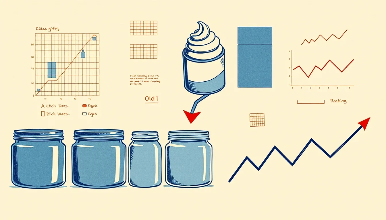
- One Trick Pony: The peanut butter brand adopted the round shape of cosmetic jars and flipped it upside down, effectively solving the natural oil separation problem.
- Runblock: The sunscreen brand completely abandoned traditional yellow-orange warmth tones in favor of a contrasting palette — green, purple, and deep black.
- Vacation: The brand creatively approached the form factor and packed sunscreen in a metal whipped cream canister, creating a powerful sensory trigger.
How Objective Are These Data: Methodology Assessment
The presented material is a qualitative expert analysis and comparison of FMCG design case studies, not a strictly controlled laboratory experiment. The sample in the study is limited to several notable Western indie brands and progressive design studios.
The described effects primarily reflect the behavior of early adopters and trendsetters. An unusual shape or unconventional color palette always carries a commercial risk.
If a shopper at a shelf or a user in a feed does not recognize the product category within a fraction of a second, conversion to purchase inevitably decreases. This is a powerful market trend that necessitates mandatory preliminary A/B testing.
What this means for marketing and advertising
Consumers are overloaded with standard visual stimuli. When all sports goods manufacturers use neon red, and the peanut butter segment is filled with a beige-brown palette, the brain simply ignores the shelf or the advertising feed.
A conscious contrast with the category instantly attracts involuntary attention from the audience and significantly increases the CTR of advertising creatives.
«Strong formats over time become part of the brand identity: you no longer need to put a huge logo on everything, because the object itself begins to do that work»
— James Horvitz, founder of Two Times Elliott agency
A skillful break of visual patterns directly reduces media promotion costs. An unconventional silhouette or a bold color solution stimulates viral reach (UGC), motivating customers to voluntarily post unboxings on social networks.
Practical guide: how to apply it in your business
To transform your visual strategy without harming commercial performance, follow this clear algorithm:
- Break category color stereotypes. Analyze the top 10 competitors in your niche. If warm shades dominate the category (as in sun protection), test cool mineral or deep contrasting tones (green, purple), following the experience of Runblock.
- Borrow metaphors from adjacent spheres. When selling cosmetics, household chemicals, or dietary supplements, pay attention to the formats of beverages, confectionery, or paints (aluminum tubes, beer cans, apothecary glass).
- Compensate for complex shapes with extremely clear text. If the visual medium looks unusual, make the category name (for example, «Peanut Butter» or «Solid Deodorant») larger and more prominent than the brand logo. This will maintain clarity for the target audience.
Comparative example of format transformation
| Parameter | Standard Approach (Before) | Pattern Break (After) |
|---|---|---|
| Form Factor | Standard white tube with a blue stripe | Matte reusable pump dispenser |
| Color Solution | Clinical white, bright blue gloss | Muted sage shade |
| User Experience | Utilitarian storage in a closed cabinet | Organic detail of the bathroom interior |
Frequently Asked Questions (FAQ)
Will the atypical product color confuse the buyer?
The risk exists. To avoid a drop in sales, the key category trigger must remain extremely obvious: use a clear text descriptor, transparent windows in the packaging, or a high-quality demonstration of the product texture on the label.
Is it necessary to change the design, or is changing the color enough?
Runblock’s experience clearly proves: it is possible to work effectively even with a basic plastic bottle. Bold accent typography and an alternative palette are capable of making a product stand out just as well as an expensive custom mold.
Conclusion
Packaging and advertising visuals work as a single ecosystem: unusual geometry and a refined palette form a stable image that is read faster than any advertising text. Check the harmony of shades and the perception of your creatives — you can calculate the color balance in RGB-Analytics before launching an advertising campaign.
Source Creative Review ↗